
The typical white screen with a large 404 error message is what far too many firms leave as is.
We get it! It’s only a 404 error page.
However, if you continue doing this, the visitor will become dissatisfied.
They will leave the website to look elsewhere because they don’t know what happened.
So, by having a personalized 404 page, you provide yourself the chance to improve the experience of your site users.
The benefit of creating your own 404 error page is that you may use your creativity to its fullest extent. It’s simply a giant canvas for a company to express its message while directing the visitor to the resources they need because there are no limitations about how your page should look.
Why Do You Need a 404 Page? What Is It?
404 pages are used to let site visitors know that a particular page is no longer available and to (ideally) send them to another area of your website.
A personalized 404 page is more than just a visually appealing message that a page is missing. It’s good to let your visitors know what happened and what they can do next. They are made to keep visitors interested so they are motivated to continue browsing your website even after reaching a “dead end.” Also, it’s a landing page informing visitors to your website that the requested page is either unavailable or, in certain situations, not even there.
Amid the aggravation of being unable to access the webpage you want, the best 404 pages might make you grin. Therefore, even if making a brilliant 404 page is generally not your top priority when building a new website, it can be worthwhile to give it some thought.
When done correctly, a decent 404 page encourages users to overlook the error (even if they were the ones who made it by inputting the URL incorrectly) and keeps them on your website.
5 Best 404 Page Examples
To identify examples of 404 sites that were either doing a good job, not doing a good job, or were generally impressive or not spectacular, we randomly searched the Internet.
Let’s take a look at five of the incredible, out of this world custom 404 error pages, and why they are so effective.
1. Mailchimp
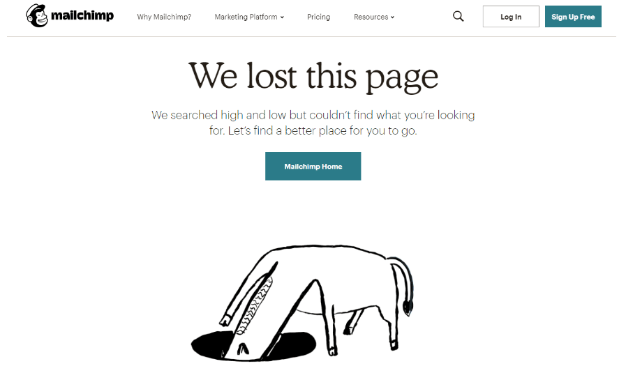
With their animated 404 page of an animal rummaging in a hole for, presumably, the lost page, email tool Mailchimp keeps things straightforward while yet being imaginative.
It’s clever and demonstrates that their 404 page wasn’t just thrown up.
2. Swiss Airlines
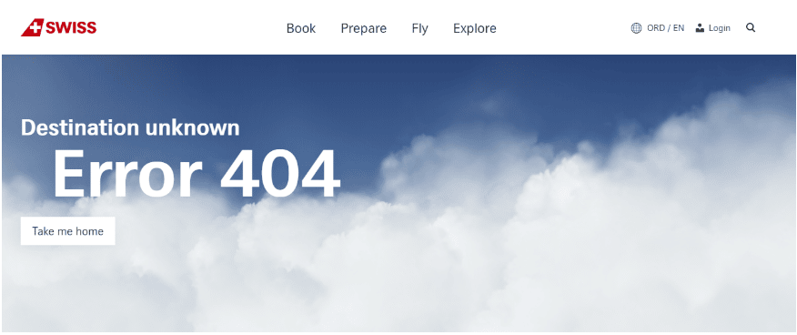
Swiss Airlines just provides a link to their homepage and the navigation bar as further information, but the graphic on their 404 page is quite interesting.
You are surrounded by clouds as you move your cursor across the website.
We must admit, we stayed on their 404 page longer than I’d want to confess because of this feature, which is intriguing.
3. Taco Bell
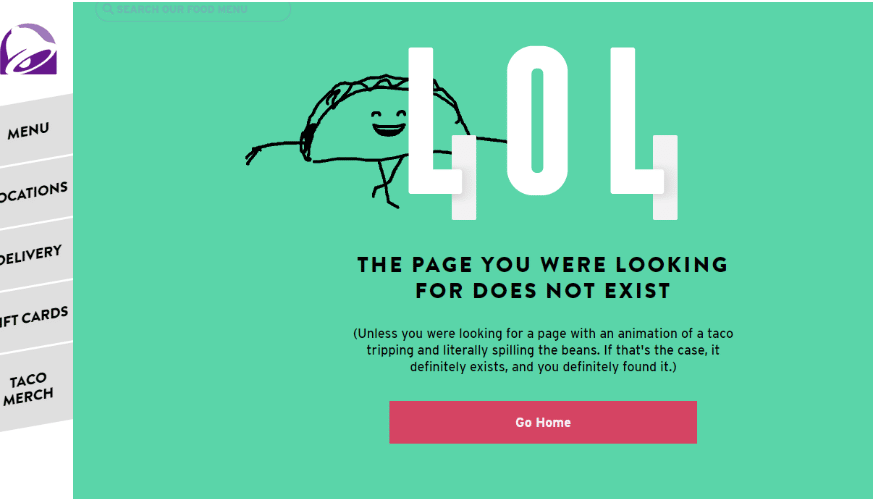
Taco Bell has a reputation for being rather irreverent. They follow suit with their 404 page.
On the page, a dancing taco spills its fillings before scooping them back into their shell.
It serves as an odd reminder that something went awry.
The page also has links to the menu, locations, and gift card and item purchase pages.
4. Marvel
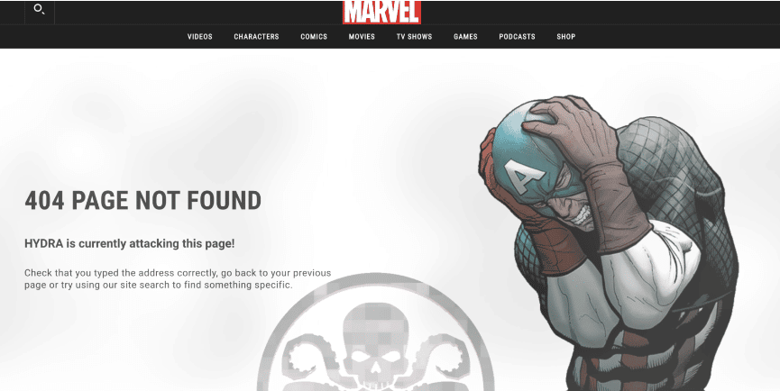
Marvel uses a revolving 404 page to showcase their various comic book heroes, including Captain America, Deadpool, and others.
Here’s a tip: Keep refreshing the page. Marvel will offer a new image every third update.
5. Zillow
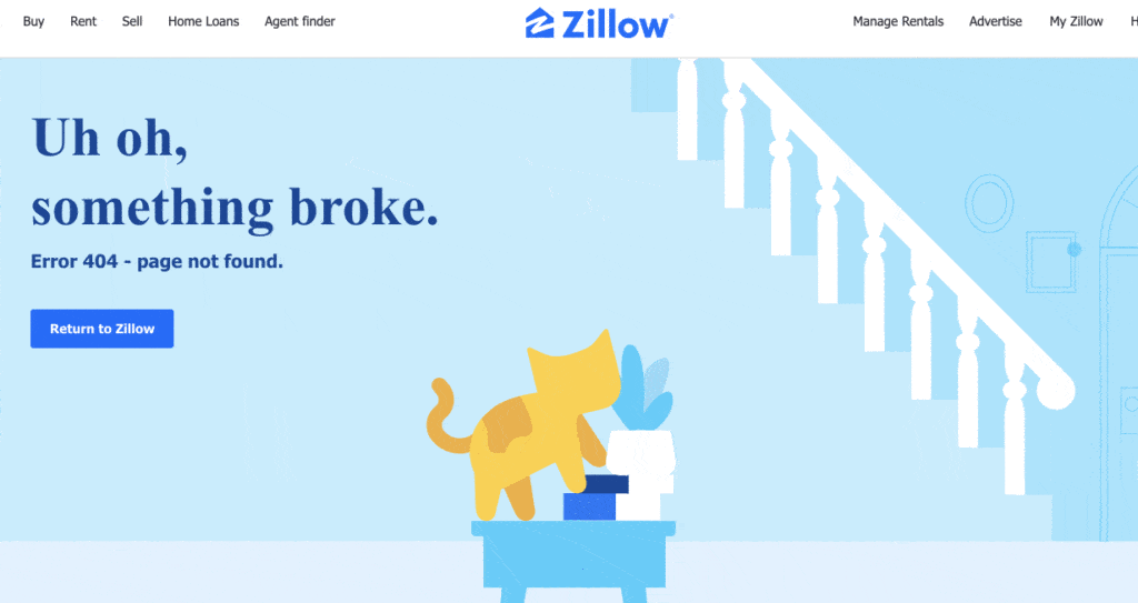
Zillow provides its home hunters with an interactive GIF perk. It uses customer data to identify the users who adore animals.
And to keep those animal lovers interested, they made this animated cat who damages things in the living room and adds a small laugh at the end.
If you’re an animal lover like us, you can relate to this!
Final Point
When a visitor sees a 404 page it’s crucial to give them direction on what to do next. Do they go back or do they go to your website’s home page? The more guidance you provide, the more probable it is that they’ll stay on your website rather than leave.
Wait. You can stay as long as you like and schedule a discovery call with us so we may continue our discussion of website issues!