

Think Differently Academy
New identity and online home for 30 years of breaking limiting patterns.
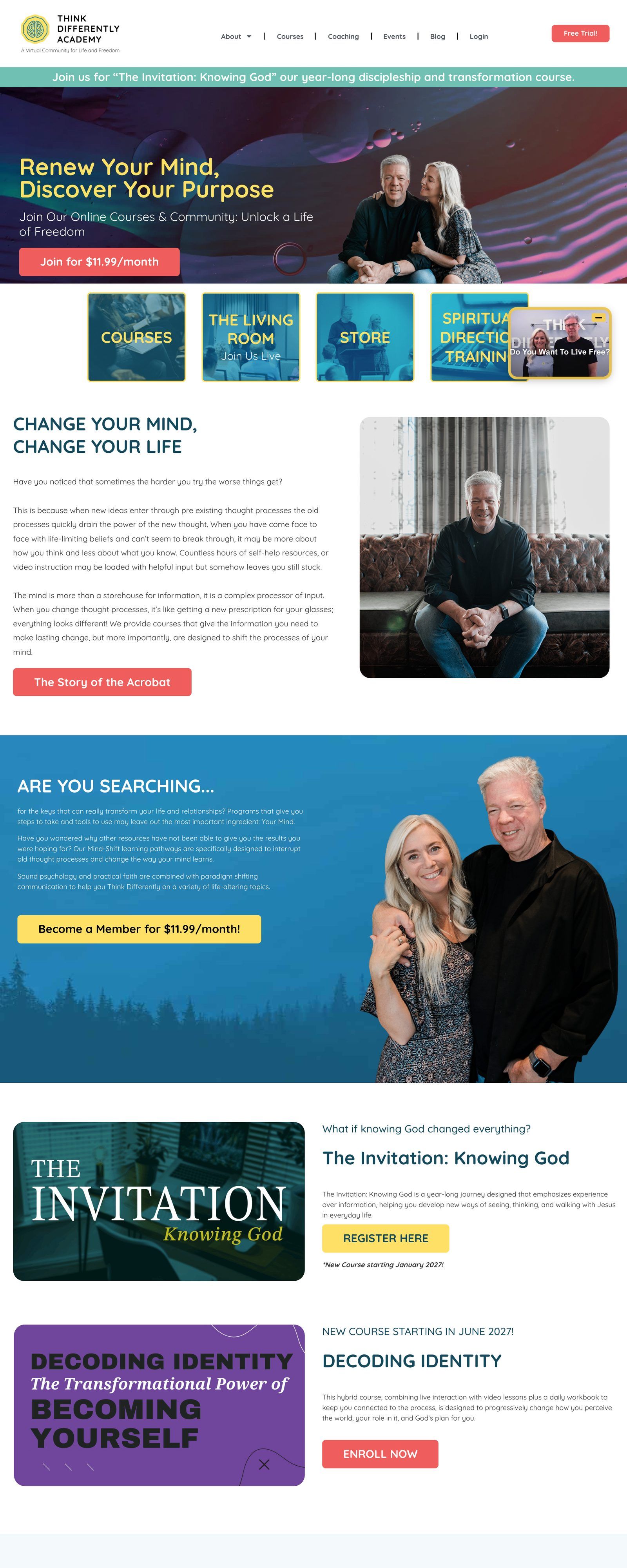

- Client Think Differently Academy
- Industry Personal development and education
- Location Texas
- Service lines
- Logo design
- Color palette and typography
- Website design
- Website development
- Site content structure
- Landing pages and funnels
What changed.
- Brand consistencyBefore
A site out of step with the brand identity
AfterOne identity across the logo, color, type, and site
- Understanding the offerBefore
Hard to see the services and who they help
AfterA site that shows what the academy does and how it helps
Where the decisions live.
Each waypoint marks one choice we made for this audience and why it earned its place.
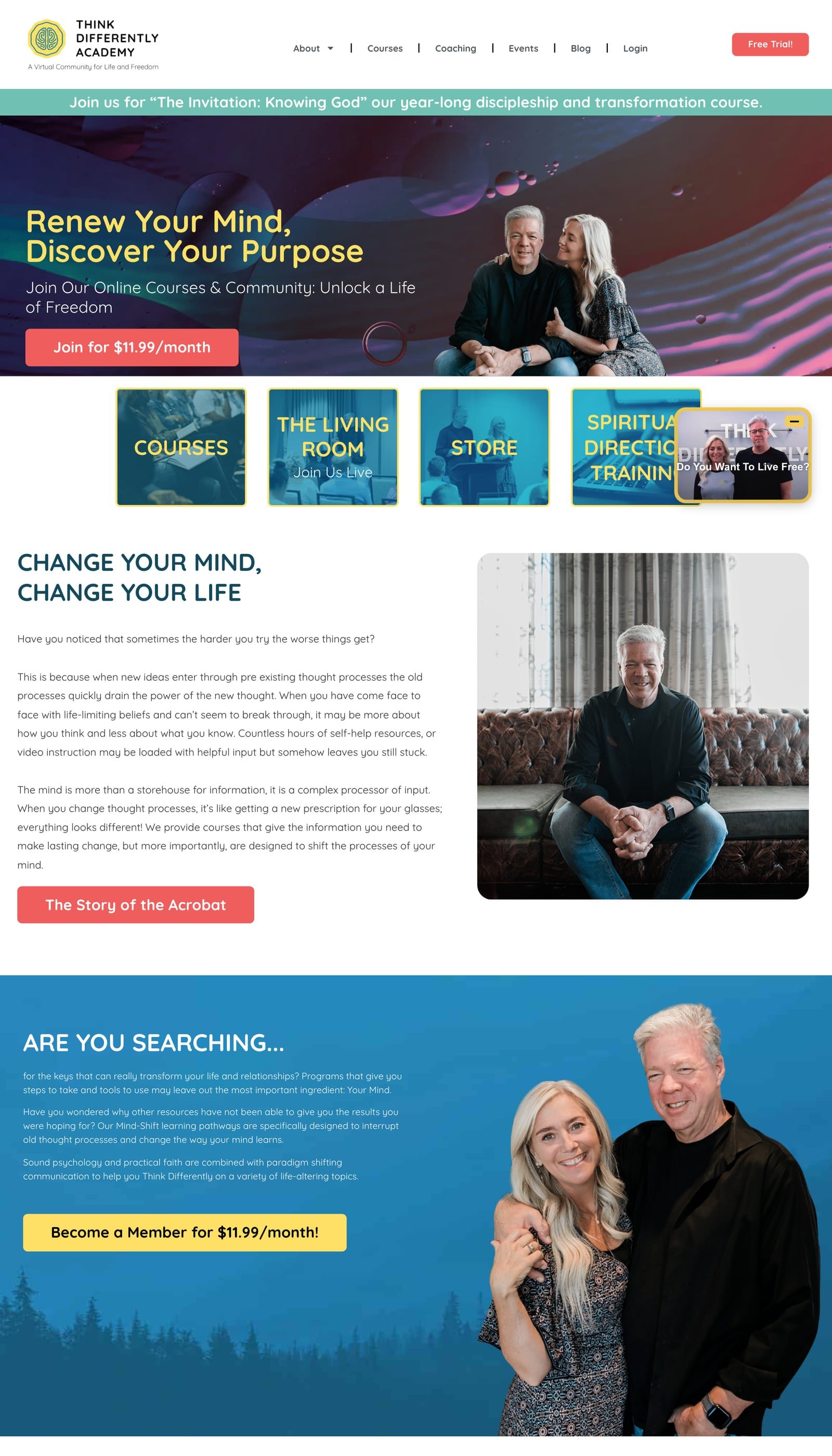
Thirty years of work behind an outdated front door.
Think Differently Academy draws on more than 30 years of experience to help people break out of limiting patterns. Rooted in psychological wisdom and biblical teaching, it helps people embrace who they are and grow.
Their previous website had grown outdated. It lacked modern features, was inconsistent with their brand identity, and struggled to convey what the academy stood for and the range of services it offers.
The result was a hurdle for the people it exists to serve. Visitors could not easily discover what the academy offers or whether it could help them.
Research, a new identity, then a clearer site.
We began with careful research and close collaboration, to get a clear picture of what the academy stands for and where it wants to go.
From that understanding we built a fresh, memorable visual identity: a logo, a color palette that works together, and typography that matches their style.
At the same time we focused on making the website easy to use. People can move through it without trouble and find what they came for.
We added content that shows what the academy does and how it can help, mixing imagery and words so the site feels like a welcoming place to learn and grow.
Beyond the first build, we have continued to support the academy with landing pages, funnels, and course platform work.
If this work resembles yours, we can show you the same starting line in three minutes.
An identity that shows what thinking differently means.
The academy now has an identity and a site that say the same thing, in one voice.
Visitors can see what Think Differently offers and how it might help them.


Keep exploring the work.
Let’s build yours next.
Score your site in three minutes for an honest read. Or have us audit it in five business days. No deck, no pitch, no obligation.