

Missio Nexus · A new brand, revealed live, with the site to match
A network of mission agencies and churches needed a public site worthy of a brand reveal on a conference stage. Six weeks from first commit to launch, with every legacy URL mapped.
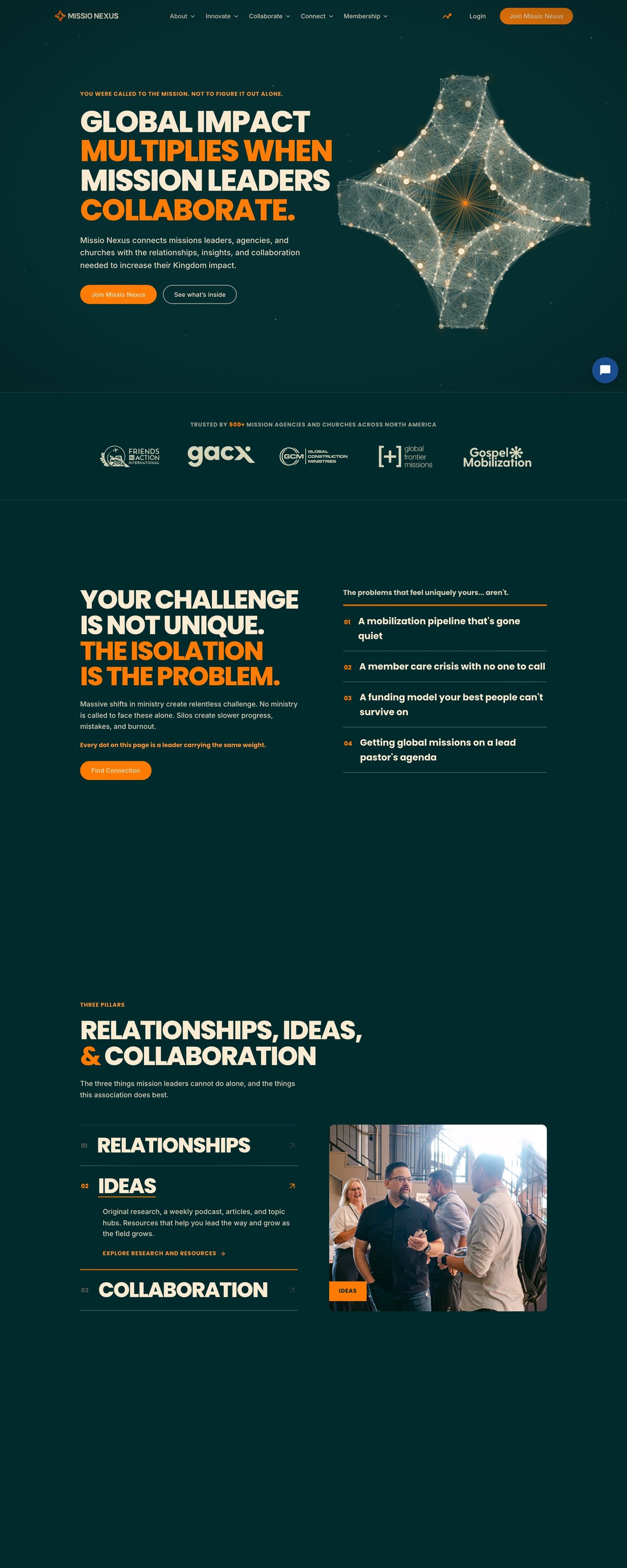

- Client Visit site
 Missio Nexus
- Industry Missions network · Association of agencies and churches
- Location North America
- Engagement Wireframes to launch in one summer, with six weeks of build
- Service lines
Services rendered
- Wireframes and dark-theme visual design across 23 page templates
- Static Astro site of 46 fixed routes plus one page per open job listing
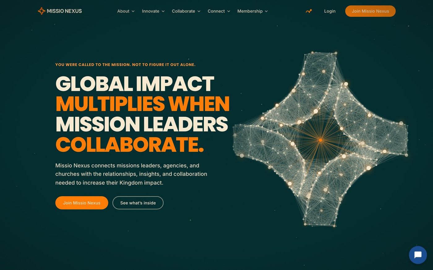
- Scroll-driven homepage where a field of points assembles into the brand mark
- Content pipeline that syncs articles, library, events, podcasts, and jobs from the member platform
- Redirect map for roughly 800 legacy URLs, sitemap, JSON-LD, and JobPosting schema
- Contact, give, and subscribe endpoints with spam protection
- Brand hub for logos, photo library, and the launch film
- Launch video, logo animation, and launch graphics
- Ongoing care and support plan
- Astro
- React islands
- TypeScript
- Cloudflare Pages
- Cloudflare Turnstile
- SendGrid
- GitHub Actions
- Figma
- Markup
What changed.
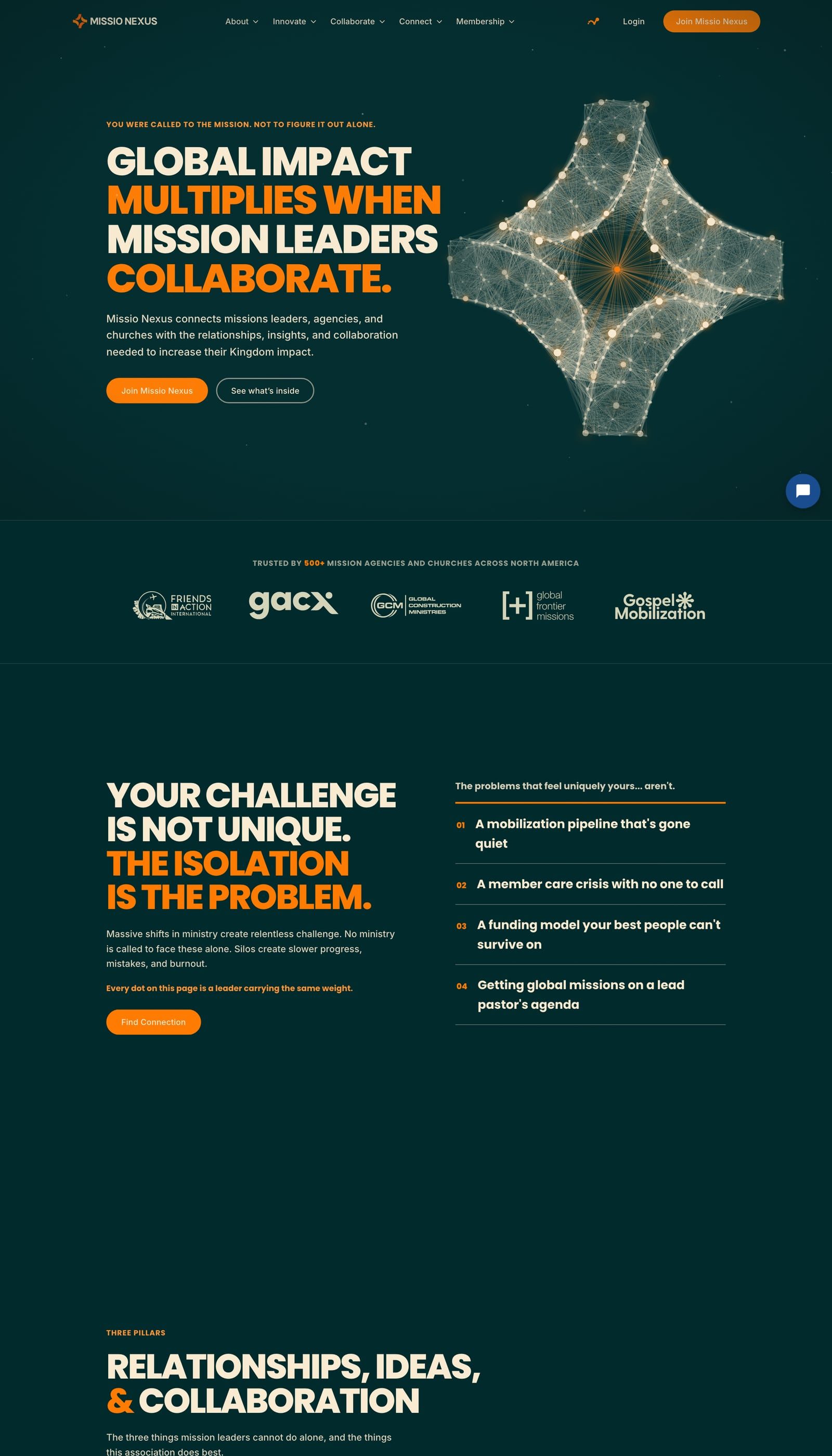
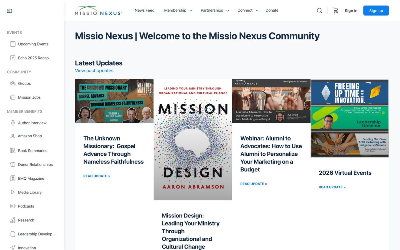
- The public front doorBefore
A member portal doubling as the marketing site
AfterA static site built for first-time visitors, synced from the portal
- Launch nightBefore
A redesign that would have to go live quietly, later
AfterA reveal on stage, with the site opened at the announced minute
- Legacy URLsBefore
Hundreds of article, event, and job paths at risk
AfterRoughly 800 routes mapped, logged, and monitored
Where the decisions live.
Each waypoint marks one choice we made for this audience and why it earned its place.
Before and after.
A reveal with a date on it.
Missio Nexus connects mission agencies and churches across North America: a conference, research, a quarterly journal, podcasts, a job board, and peer cohorts. The organization was mid-rebrand with Branches Lab, and the new identity was going to be revealed live on stage at the Mission Leaders Conference.
The public website had to carry that moment. It also had to carry a decade of content living inside a single WordPress and BuddyBoss install that doubled as the member portal, where slow, uncacheable pages were the norm. Hundreds of article, event, and job URLs had search equity that could not be dropped on launch night.
So the brief was two things at once: a site that makes a first-time visitor feel what the brand promises, and a migration quiet enough that nobody in the room would notice it happened.
One canvas, many rooms.
We started with the audience and the one thing they needed to do: see themselves in the network and join it. That shaped the homepage as a single scroll with eleven acts, from the call to the mission, through the problem of isolation, to proof, membership, and the invitation. One fixed canvas of points runs behind the whole page. It begins scattered, draws together into the Missio Nexus mark, then opens into a connected mesh as you move down the story.
The hero weaves 23 partner logos into that mesh as hoverable points, so the network is the picture, not a stock photo of people shaking hands. Interior pages switch between dark and light themes by purpose, and every motion fails open without JavaScript and switches off under reduced-motion settings.
Under the design is a static Astro build with React only where state is real: the menu, a dues calculator, the logo field. Content from the member platform arrives through a twice-daily sync that snapshots articles, library items, events, podcasts, and job listings, so builds never wait on a 2.4 second origin and paywalled material stays behind the wall.
Migration was mapped before launch. About 800 legacy URLs route to their new homes, old article and journal paths have their own rules, www folds into the apex, and a 404 log watches for anything we missed. Sitemap, structured data, and JobPosting schema shipped on day one.
Launch itself ran behind a coming-soon splash with a cookie-keyed gate, so the finished site could be reviewed in place and opened by hand at the announced moment. A brand hub at brand.missionexus.org followed, regenerating its logo, photo, and film pages from the site repo on every merge.
5 phases, this engagement.
Every engagement has its own arc. Here is what shipped, in order, for this one.
- 01
Wireframes
JuneFigma wireframes for every template, reviewed with the team in-file.
- 02
Visual design
July to AugustDark-theme homepage first, revised with leadership feedback, then interiors.
- 03
Build and sync
Six weeksAstro build, content pipeline from the member platform, redirect map.
- 04
Staged launch
SeptemberGated review behind the splash, then opened live at the conference.
- 05
Brand hub and care
OngoingLogo, photo, and film hub for partners; ongoing support plan.
The room cheered, the site held.
The brand was revealed on stage at the Mission Leaders Conference in September 2026, and the public site opened the same week. The team described meeting that deadline as a significant accomplishment, and the launch film and logo animation we produced became the pieces the client chose to run with.
Every legacy URL that mattered has a destination, the site builds hundreds of pages in minutes from live member data, and the brand hub gives the staff and partners one place to pull the right logo. Ongoing care continues, and measurement is now in place so the next chapter can be written in numbers.
What it looked like.


Keep exploring the work.
Let’s build yours next.
Score your site in three minutes for an honest read. Or have us audit it in five business days. No deck, no pitch, no obligation.